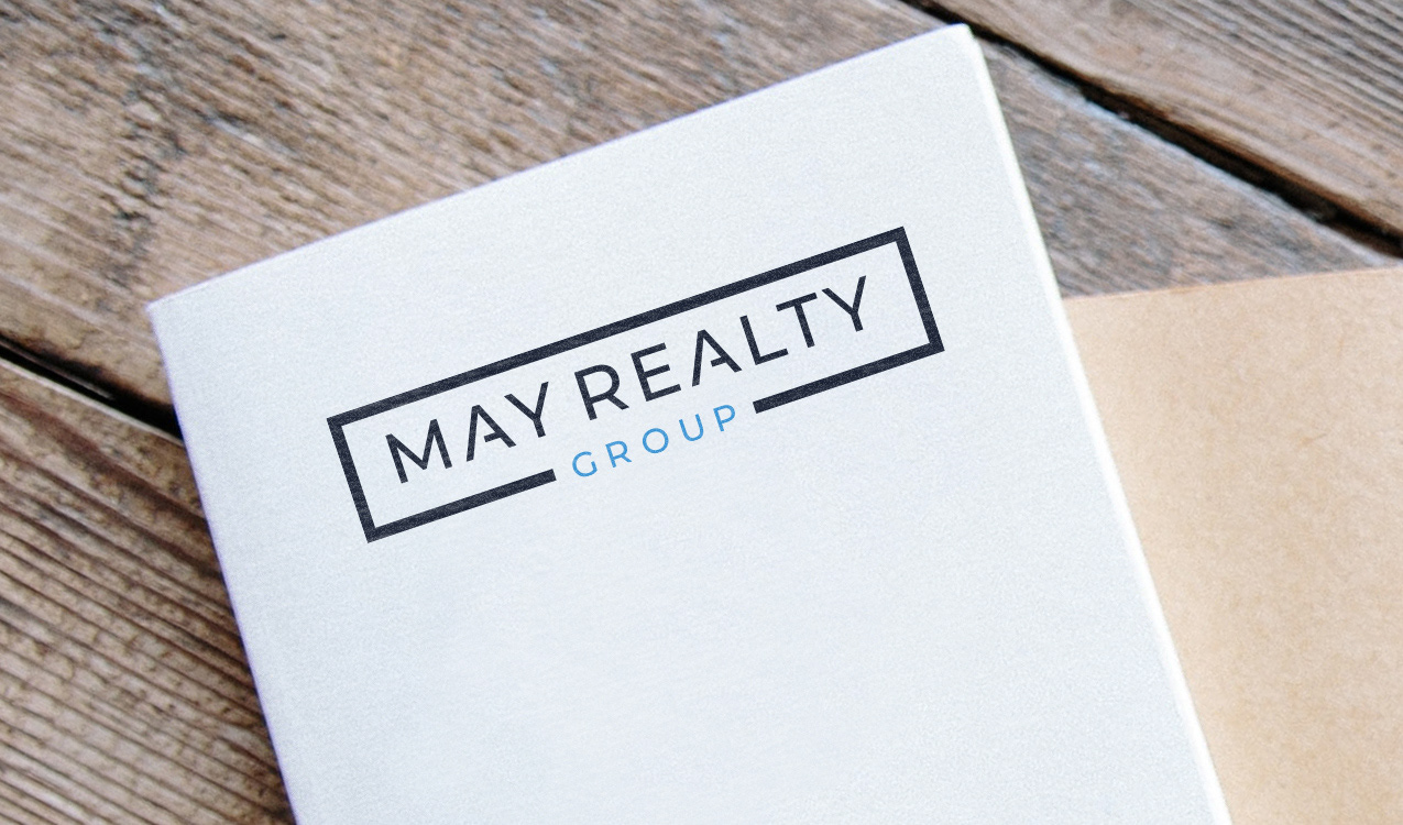
A minimal and modern brand identity for May Realty Group required an elegant, memorable, timeless, and easily recognizable style. To achieve this, the logo should be simple and uncluttered, using clean lines and a limited color palette. The logo needed to incorporate a stylized typography should be legible and complementary to the overall design. The logo needed to work equally well in both vertical and horizontal orientations, allowing for versatility in its use across various marketing materials. Overall, the brand identity communicates the essence of the May Realty Group brand in a concise and visually appealing manner, while also being flexible enough to adapt to different contexts and applications from emails to yard signs.